Here I am following Angular Material UI framwork to design different type headers. To create header, we can use md-toolbar
<md-toolbar>
   <div class="md-toolbar-tools">
     <h2>
        <span>Heading</span>
      </h2>
    </div>
</md-toolbar>
Add Creating Header Icon
Now add header icon. The below highlighted text add header icon
<div class="md-toolbar-tools">
   <md-button class="md-icon-button" aria-label="Icon">
       <md-icon md-svg-icon="fb.svg"></md-icon>
   </md-button>
   <h2>
       <span>Heading</span>
   </h2>
</div>
Add icons to right side
Add icons to right side of header. By using flex property, the middle space between left and right side icons was occupied. Here I have added messages and user icon.
<md-toolbar>
      <div class="md-toolbar-tools">
        <md-button class="md-icon-button" aria-label="Icon">
          <md-icon class="md-default-theme" md-svg-icon="fb.svg"></md-icon>
        </md-button>
        <h2>
          <span>Heading</span>
        </h2>
        <span flex></span>
        <md-button class="md-icon-button" aria-label="User">
          <img src="user.png" style="width:24px;height:24px;"></md-icon>
        </md-button>
        <md-button class="md-icon-button" aria-label="Messages">
          <img src="messages.png" style="width:24px;height:24px;"></md-icon>
        </md-button>
      </div>
 </md-toolbar>
Add tooltip to icons
Whenever user access website in PC, we should show some sort of helping text for it. Here I have added tooltip for right side icons.
<md-toolbar>
    <div class="md-toolbar-tools">
        <md-button class="md-icon-button" aria-label="Icon">
          <md-tooltip>User</md-tooltip>
          <md-icon class="md-default-theme" md-svg-icon="fb.svg"></md-icon>
        </md-button>
        <h2>
          <span>Heading</span>
        </h2>
        <span flex></span>
        <md-button class="md-icon-button" aria-label="User">
          <md-tooltip>User</md-tooltip>
          <img src="user.png" style="width:24px;height:24px;"/>
        </md-button>
        <md-button class="md-icon-button" aria-label="Messages">
          <md-tooltip>Messages</md-tooltip>
          <img src="messages.png" style="width:24px;height:24px;"/>
        </md-button>
   </div>
</md-toolbar>

Add Google Material Icon Font
Google is providing some material icons and you can find them here
<link href="https://fonts.googleapis.com/icon?family=Material+Icons" rel="stylesheet">
Add Search Text Box
Here I implemented two designs. One is for desktop web and another is for mobile web.
<md-input-container md-no-float class="md-accent" flex="50" style="padding-bottom:0px;margin-left:25px"> <md-icon style="color:wheat" class="material-icons"></md-icon> <input ng-model="searchInput" placeholder="Search here" style="color:wheat;padding-left:25px;margin-left:5px"> </md-input-container>
Responsive Versions For Desktop, Tablet And Mobile
.mobile css class is for mobile devices. .tablet css class is for tablet devices. .desktop is for PCs and laptops

@media only screen
  and (max-width: 736px) {
  .mobile {
    display:block;
  }
  .desktop {
    display:none;
  }
  .tablet {
    display:none;
  }
}

@media only screen
  and (min-width: 736px)
  and (max-width: 1200px){
  .tablet {
    display:block;
  }
  .desktop {
    display:none;
  }
  .mobile {
    display:none;
  }
}

@media only screen
  and (min-width: 1200px) {
  .desktop {
    display:block;
  }
  .tablet {
    display:none;
  }
  .mobile {
    display:none;
  }
}
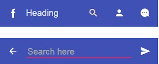
<md-toolbar class="mobile"> <div class="md-toolbar-tools" data-ng-show="showMobileMainHeader"> <md-button class="md-icon-button" aria-label="Icon"> <md-tooltip>Icon</md-tooltip> <md-icon class="md-default-theme" md-svg-icon="fb.svg"></md-icon> </md-button> <h2> <span>Heading</span> </h2> <span flex></span> <md-button class="md-icon-button" aria-label="Search" data-ng-click="showMobileMainHeader = false"> <md-tooltip>Search</md-tooltip> <md-icon class="material-icons"></md-icon> </md-button> <md-button class="md-icon-button" aria-label="User"> <md-tooltip>User</md-tooltip> <img src="user.png" style="width:24px;height:24px;"/> </md-button> <md-button class="md-icon-button" aria-label="Messages"> <md-tooltip>Messages</md-tooltip> <img src="messages.png" style="width:24px;height:24px;"/> </md-button> </div> <div class="md-toolbar-tools" data-ng-hide="showMobileMainHeader"> <md-button class="md-icon-button" aria-label="Back" data-ng-click="showMobileMainHeader = true"> <md-tooltip>Back</md-tooltip> <md-icon class="material-icons"></md-icon> </md-button> <md-input-container md-no-float class="md-accent" style="padding-bottom:0px;"> <input ng-model="searchInput" placeholder="Search here" style="color:wheat;"> </md-input-container> <span flex></span> <md-button class="md-icon-button" aria-label="Search"> <md-tooltip>Search</md-tooltip> <md-icon class="material-icons"></md-icon> </md-button> </div> </md-toolbar>
Custom Theme
You can display this header in your custom theme. This header contains Pink as primary and Orange and secondary color

angular.module('MyApp',['ngMaterial'])
.config(function($mdThemingProvider) {
  $mdThemingProvider.theme('default')
    .primaryPalette('pink')
    .accentPalette('orange');
})
.controller('AppCtrl', function($scope) {
    $scope.showMobileMainHeader = true;
});

for some reason, the Search box doesnt work properly. In mobile devices it doesnt get the effect of closing and opening a search box.
ReplyDeletePlease can you provide a zip file of you code and I can try running that
Now, I have added the download link...please download it
Deletehi how to download
DeleteI've been looking for some header/toolbar tutorial and there's good information here thank you
ReplyDelete